Blue is a color that’s as versatile as your favorite pair of jeans. It can be calming like a clear sky or bold like a midnight ocean. But what happens when it’s time to pair blue with other colors? That’s where the magic happens! Finding the right companions for blue can transform any outfit or space from drab to fab faster than you can say “color wheel.”
Understanding Blue
Blue stands out for its versatility, offering a calming yet bold aesthetic. Understanding its psychological and visual aspects enhances color pairing possibilities.
The Psychology of Blue
Blue evokes feelings of tranquility, trust, and loyalty. It’s often associated with nature, reflecting calm skies and deep oceans. Research shows blue can lower heart rates and reduce stress, making it a popular choice for spaces like bedrooms and offices. Additionally, brands utilize blue in logos to promote a sense of dependability. Emotional responses to blue can vary depending on the shade, influencing its effectiveness in design choices.
Different Shades of Blue
Numerous shades of blue present unique characteristics. Navy delivers a timeless, sophisticated appeal often used in formal settings. Sky blue, on the other hand, offers a light, airy touch suitable for casual environments. Cobalt blue is vibrant and energetic, perfect for making bold statements. Each shade interacts differently with complementary colors, enhancing overall aesthetic outcomes. For instance, pairing navy with gold creates elegance, while turquoise and coral lend a playful feel. Understanding these shades allows for thoughtful color combinations that resonate visually.
Complementary Colors to Blue
Complementary colors enhance blue, creating striking and vibrant visuals. The following sections explore optimal color pairings.
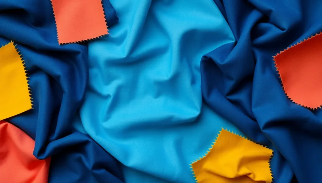
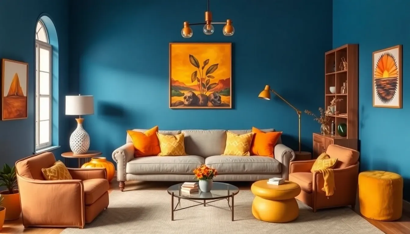
Orange and Its Variants
Orange stands as a perfect complement to blue. Shades like coral and peach harmonize beautifully, introducing warmth into the palette. Bright orange creates a high-energy contrast that can elevate both casual and formal looks. Deep peach provides a softer contrast, making it suitable for interiors. Pairing these colors brings out the best in both, adding depth and enthusiasm to any combination.
The Balance of Warmth and Coolness
Balancing warmth and coolness enhances visual appeal. Combining blue with warm hues promotes energizing atmospheres while maintaining a calming effect. For instance, pairing cerulean blue with mustard yellow establishes a dynamic yet grounded vibe. Mixing light blue with terracotta achieves a soothing, rustic charm that works well in spaces and outfits alike. Striking the right balance contributes to a harmonious aesthetic, ensuring both colors shine.
Analogous Colors to Blue
Analogous colors sit adjacent to blue on the color wheel, producing pleasing visual effects when combined. These colors include various shades of green and purple, each contributing unique qualities to the palette.
Green: The Harmonious Pair
Green complements blue effectively, with shades like teal, mint, and emerald creating a serene atmosphere. This pairing evokes feelings of nature, freshness, and tranquility. When using teal alongside navy, the combination achieves a rich, sophisticated look. Mint green, when combined with sky blue, delivers a light and airy vibe suitable for casual spaces or summer outfits. Emerald green introduces a bold yet balanced element, particularly in modern interiors. Each shade infuses energy into the overall aesthetic, enhancing blue’s calming presence while adding visual interest.
Purple: Adding Depth and Vibrancy
Purple provides a striking contrast to blue, enhancing depth and vibrancy. Shades such as lavender and eggplant elevate the ambiance in distinct ways. Lavender softens blue’s intensity, making it ideal for whimsical designs in both fashion and decor. Eggplant, a deeper tone, adds richness and sophistication to palettes that incorporate darker blues. The combination of royal blue with violet creates a regal appearance, suitable for elegant settings. These shades harmoniously blend while allowing individual colors to shine, resulting in visually captivating combinations.
Neutrals That Pair Well with Blue
Neutral colors complement blue effectively, enhancing its beauty and depth. They soften blue’s boldness while providing a balanced palette.
Whites and Off-Whites
Whites and off-whites create a fresh and airy feel alongside blue. Pure white offers a crisp contrast, making blue appear more vibrant. Off-white shades, such as cream or eggshell, introduce warmth without overwhelming, perfect for cozy spaces. This combination often features in coastal designs, where blue conveys oceanic themes, and white embodies sandy shores.
Grays: A Versatile Choice
Grays bring sophistication to any blue pairing. Light gray serves as a subtle backdrop, allowing blue to shine. Dark gray adds elegance and a touch of drama, creating a striking balance. Combining blue with grays results in modern aesthetics suitable for both contemporary and traditional settings. This duo works well in living spaces, accentuating blue elements without competing for attention.
Tips for Combining Colors with Blue
Combining colors with blue can create visually appealing effects in both fashion and interior design. Understanding how to blend shades and utilize textures makes a difference.
Patterns and Textures
Incorporating patterns enriches blue’s versatility. Stripes in complementary colors can add energy, while floral designs introduce a softer touch. Textured fabrics, like suede or linen, create depth against blue. Pairing a blue backdrop with geometric prints establishes a modern vibe. Layering textures can also enhance the overall aesthetic, providing contrast and interest.
Lighting and Its Impact
Lighting significantly influences how blue appears in a space. Natural light brightens shades, making blue come alive. Soft, warm lights can create a cozy atmosphere, while cool lights enhance blue’s calming effect. Experimenting with different light sources allows for adjustments in the color’s tone. Evening settings often soften blue, making it more inviting. Understanding this interplay helps in achieving the desired ambiance.
Exploring the color blue reveals its remarkable versatility and appeal. By thoughtfully pairing blue with complementary, analogous, and neutral colors, one can create stunning visual effects that enhance any outfit or space. The right combinations not only elevate aesthetics but also evoke specific emotions, making blue a powerful choice in design. Whether it’s the calming presence of teal or the vibrant contrast of orange, each pairing offers unique possibilities. Embracing patterns and textures further enriches the overall impact, allowing blue to shine in various contexts. With an understanding of these dynamics, anyone can masterfully incorporate blue into their color palette.